Plotting and Visualizing Simulated Output
Visualizing simulated results, is a critical step in understanding and communicating model behavior. Visualization serves as the blueprint of any experiment as it generates scientific insight underlying the data. The goal of this tutorial, therefore, is to help you quickly set up, diagnose, and report your simulation outcomes effectively, enabling clear interpretation and compelling presentation of your results.
from apsimNGpy.core.experimentmanager import ExperimentManager
from matplotlib import pyplot as plt
Create the experiment
model = ExperimentManager('Maize', out_path = 'my_experiment.apsimx')
# init the experiment
model.init_experiment(permutation =True)
Adding factors to the experiment
Adding factors to the experiment requires that we understand the model structure. This can be accomplished
by: inspect_model(), inspect_file(),
inspect_model_parameters_by_path()
Inspect the whole simulation tree
model.inspect_file()
└── Simulations: .Simulations
  ├── DataStore: .Simulations.DataStore
  └── Experiment: .Simulations.Experiment
      ├── Factors: .Simulations.Experiment.Factors
      │   └── Permutation: .Simulations.Experiment.Factors.Permutation
      └── Simulation: .Simulations.Experiment.Simulation
          ├── Clock: .Simulations.Experiment.Simulation.Clock
          ├── Field: .Simulations.Experiment.Simulation.Field
          │   ├── Fertilise at sowing: .Simulations.Experiment.Simulation.Field.Fertilise at sowing
          │   ├── Fertiliser: .Simulations.Experiment.Simulation.Field.Fertiliser
          │   ├── Harvest: .Simulations.Experiment.Simulation.Field.Harvest
          │   ├── Maize: .Simulations.Experiment.Simulation.Field.Maize
          │   ├── Report: .Simulations.Experiment.Simulation.Field.Report
          │   ├── Soil: .Simulations.Experiment.Simulation.Field.Soil
          │   │   ├── Chemical: .Simulations.Experiment.Simulation.Field.Soil.Chemical
          │   │   ├── NH4: .Simulations.Experiment.Simulation.Field.Soil.NH4
          │   │   ├── NO3: .Simulations.Experiment.Simulation.Field.Soil.NO3
          │   │   ├── Organic: .Simulations.Experiment.Simulation.Field.Soil.Organic
          │   │   ├── Physical: .Simulations.Experiment.Simulation.Field.Soil.Physical
          │   │   │   └── MaizeSoil: .Simulations.Experiment.Simulation.Field.Soil.Physical.MaizeSoil
          │   │   ├── Urea: .Simulations.Experiment.Simulation.Field.Soil.Urea
          │   │   └── Water: .Simulations.Experiment.Simulation.Field.Soil.Water
          │   ├── Sow using a variable rule: .Simulations.Experiment.Simulation.Field.Sow using a variable rule
          │   └── SurfaceOrganicMatter: .Simulations.Experiment.Simulation.Field.SurfaceOrganicMatter
          ├── Graph: .Simulations.Experiment.Simulation.Graph
          │   └── Series: .Simulations.Experiment.Simulation.Graph.Series
          ├── MicroClimate: .Simulations.Experiment.Simulation.MicroClimate
          ├── SoilArbitrator: .Simulations.Experiment.Simulation.SoilArbitrator
          ├── Summary: .Simulations.Experiment.Simulation.Summary
          └── Weather: .Simulations.Experiment.Simulation.Weather
Inspect the full paths to the manager scripts in the model
model.inspect_model('Models.Manager')
['.Simulations.Experiment.Simulation.Field.Sow using a variable rule',
 '.Simulations.Experiment.Simulation.Field.Fertilise at sowing',
 '.Simulations.Experiment.Simulation.Field.Harvest']
Inspect the names to the manager scripts in the model
model.inspect_model('Models.Manager', fullpath=False)
['Sow using a variable rule', 'Fertilise at sowing', 'Harvest']
If we want to edit any of the above script in the experiment, there is need to inspect the associated underlying parameters
‘.Simulations.Experiment.Simulation.Field.Sow using a variable rule’
model.inspect_model_parameters_by_path('.Simulations.Experiment.Simulation.Field.Sow using a variable rule')
   {'Crop': 'Maize',
'StartDate': '1-nov',
'EndDate': '10-jan',
'MinESW': '100.0',
'MinRain': '25.0',
'RainDays': '7',
'CultivarName': 'Dekalb_XL82',
'SowingDepth': '30.0',
'RowSpacing': '750.0',
'Population': '6.0'}
‘.Simulations.Experiment.Simulation.Field.Fertilise at sowing’
model.inspect_model_parameters_by_path('.Simulations.Experiment.Simulation.Field.Fertilise at sowing')
{'Crop': 'Maize', 'FertiliserType': 'NO3N', 'Amount': '160.0'}
Add factors along the the paramters; Amount and Population from the last and first scripts, respectively.
# Population
model.add_factor(specification='[Sow using a variable rule].Script.Population = 4, 6, 8, 10', factor_name='Population')
# Nitrogen fertilizers
model.add_factor(specification='[Fertilise at sowing].Script.Amount= 0, 100,150, 200, 250', factor_name= 'Nitrogen')
Before we run,let’s add one report variable for an easy demonstration
model.add_report_variable(variable_spec=['[Clock].Today.Year as year'], report_name='Report')
# run the model to generate output
model.run()
Inspect the simulated results
model.results.info()
<class 'pandas.core.frame.DataFrame'>
 RangeIndex: 200 entries, 0 to 199
 Data columns (total 19 columns):
  #   Column                            Non-Null Count  Dtype
 ---  ------                            --------------  -----
  0   CheckpointID                      200 non-null    int64
  1   SimulationID                      200 non-null    int64
  2   Experiment                        200 non-null    object
  3   Population                        200 non-null    object
  4   Nitrogen                          200 non-null    object
  5   Zone                              200 non-null    object
  6   Clock.Today                       200 non-null    object
  7   Maize.Phenology.CurrentStageName  200 non-null    object
  8   Maize.AboveGround.Wt              200 non-null    float64
  9   Maize.AboveGround.N               200 non-null    float64
  10  Yield                             200 non-null    float64
  11  Maize.Grain.Wt                    200 non-null    float64
  12  Maize.Grain.Size                  200 non-null    float64
  13  Maize.Grain.NumberFunction        200 non-null    float64
  14  Maize.Grain.Total.Wt              200 non-null    float64
  15  Maize.Grain.N                     200 non-null    float64
  16  Maize.Total.Wt                    200 non-null    float64
  17  year                              200 non-null    int64
  18  source_table                      200 non-null    object
 dtypes: float64(9), int64(3), object(7)
 memory usage: 29.8+ KB
# By default, the parameter name of each factor is also populated in the data frame.
Statistical results for each column
model.results.describe()
  CheckpointID  SimulationID  Maize.AboveGround.Wt  Maize.AboveGround.N  \
count         200.0    200.000000            200.000000           200.000000
mean            1.0     10.500000           1067.600206            10.239469
std             0.0      5.780751            607.686584             6.299485
min             1.0      1.000000             51.423456             0.320986
25%             1.0      5.750000            708.023479             5.095767
50%             1.0     10.500000            987.749088             9.423852
75%             1.0     15.250000           1579.116949            15.402366
max             1.0     20.000000           2277.481374            22.475693

              Yield  Maize.Grain.Wt  Maize.Grain.Size  \
count    200.000000      200.000000        200.000000
mean    4765.995363      476.599536          0.245769
std     3093.295392      309.329539          0.073753
min        0.000000        0.000000          0.000000
25%     2535.993006      253.599301          0.223099
50%     3894.863108      389.486311          0.274101
75%     7819.712885      781.971288          0.299073
max    10881.111792     1088.111179          0.315281

       Maize.Grain.NumberFunction  Maize.Grain.Total.Wt  Maize.Grain.N  \
count                  200.000000            200.000000     200.000000
mean                  1890.470249            476.599536       6.187685
std                   1077.127429            309.329539       4.118276
min                      0.000000              0.000000       0.000000
25%                    979.352980            253.599301       3.051965
50%                   1855.994293            389.486311       5.112196
75%                   2861.250716            781.971288      10.372698
max                   3726.740206           1088.111179      13.852686

       Maize.Total.Wt         year
count      200.000000   200.000000
mean      1167.632796  1995.500000
std        656.486381     2.879489
min         53.721510  1991.000000
25%        774.862931  1993.000000
50%       1104.093752  1995.500000
75%       1705.820275  1998.000000
max       2457.083319  2000.000000
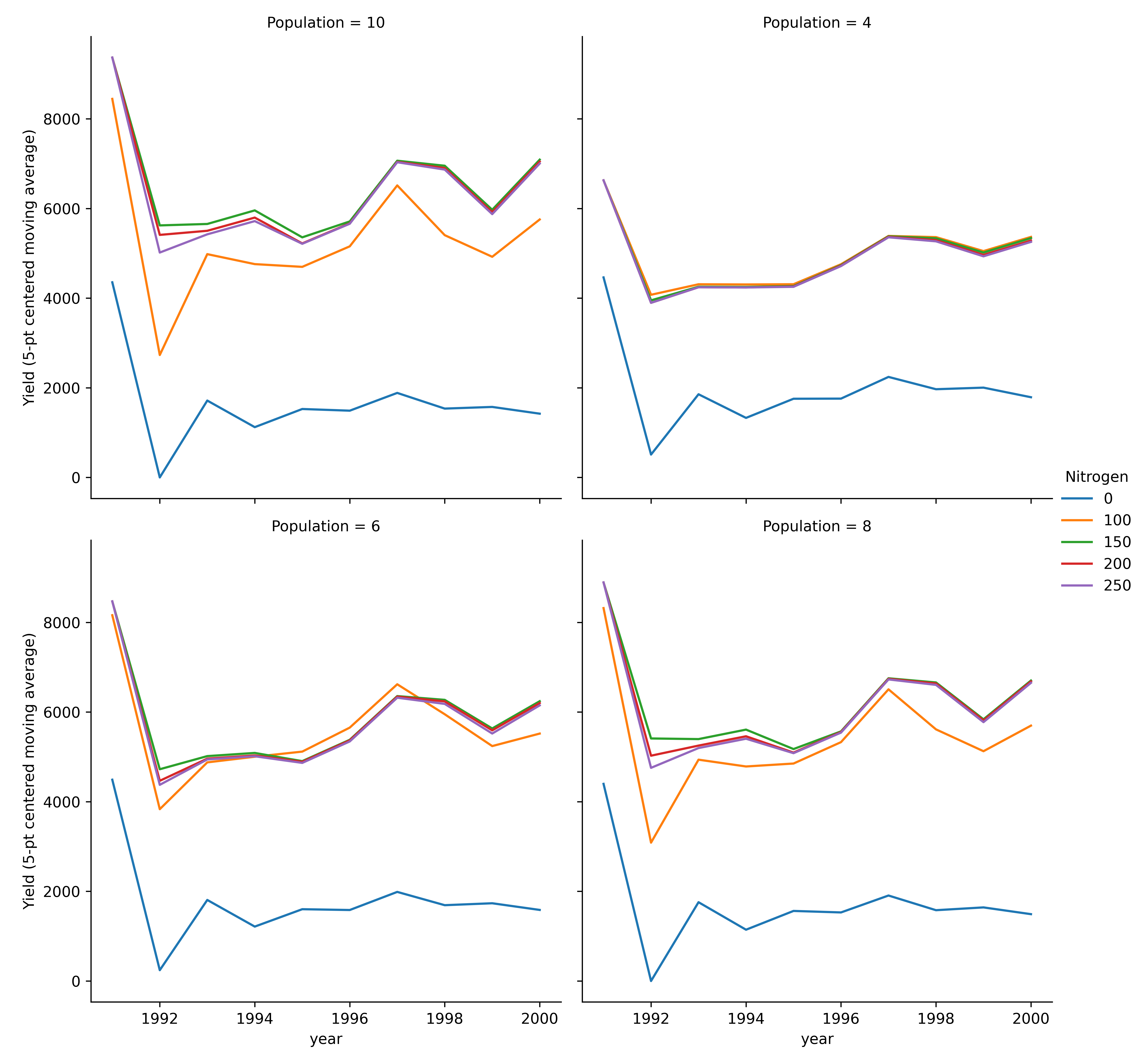
Moving average plots
model.plot_mva(table='Report', response='Yield', time_col='year', col_wrap=2, palette='tab10',
   errorbar=None, estimator='mean', grouping=('Amount', 'Population'), hue='Nitrogen', col='Population')
Multi-year moving average for each experiment (line plot).
Categorical Plots
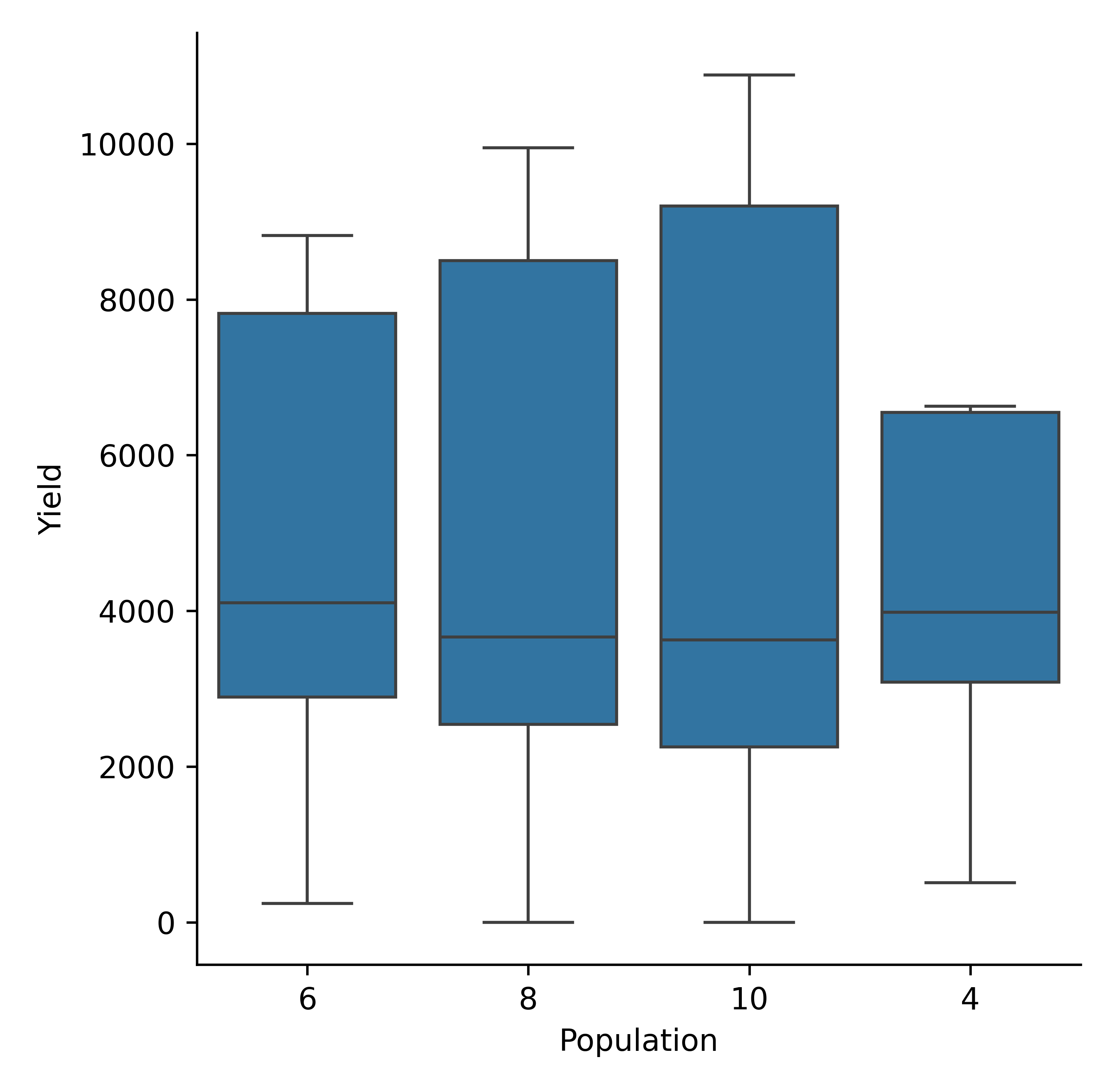
Box plots
model.cat_plot(table = 'Report', y='Yield', x= 'Population', kind = 'box')
Maize yield variability by population density (mva plot).
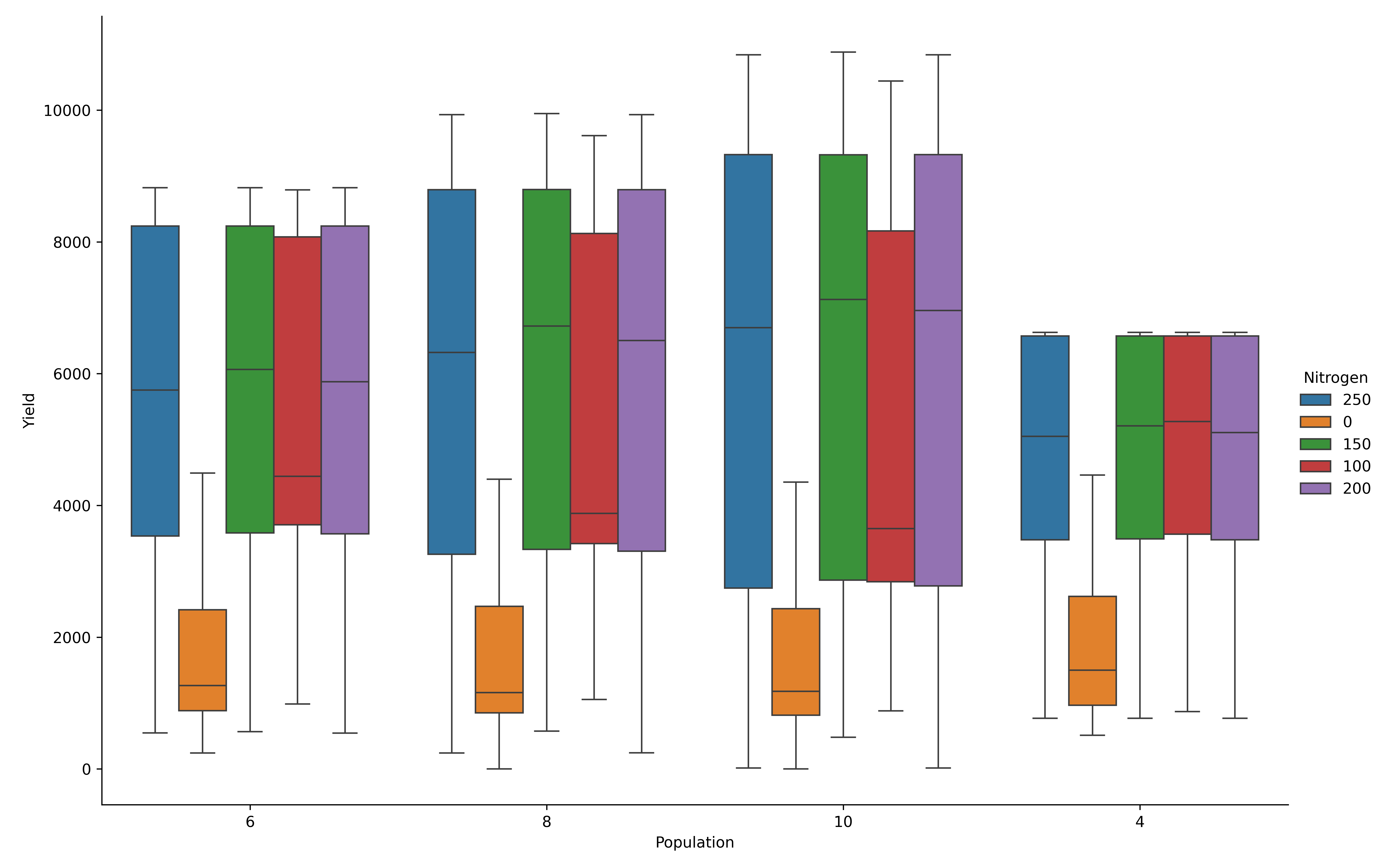
Add Nitrogen fertilizer as hue for contrast across the nitrogen treatments
model.cat_plot(table = 'Report', y='Yield', x= 'Population', palette='tab10',
           kind = 'box', hue= 'Nitrogen', height=8, aspect=1.5)
plt.savefig(dir_p/’hue_nitrogen.png’, dpi=600)
Maize yield variability by population density and nitrogen fertilizer (box plot).
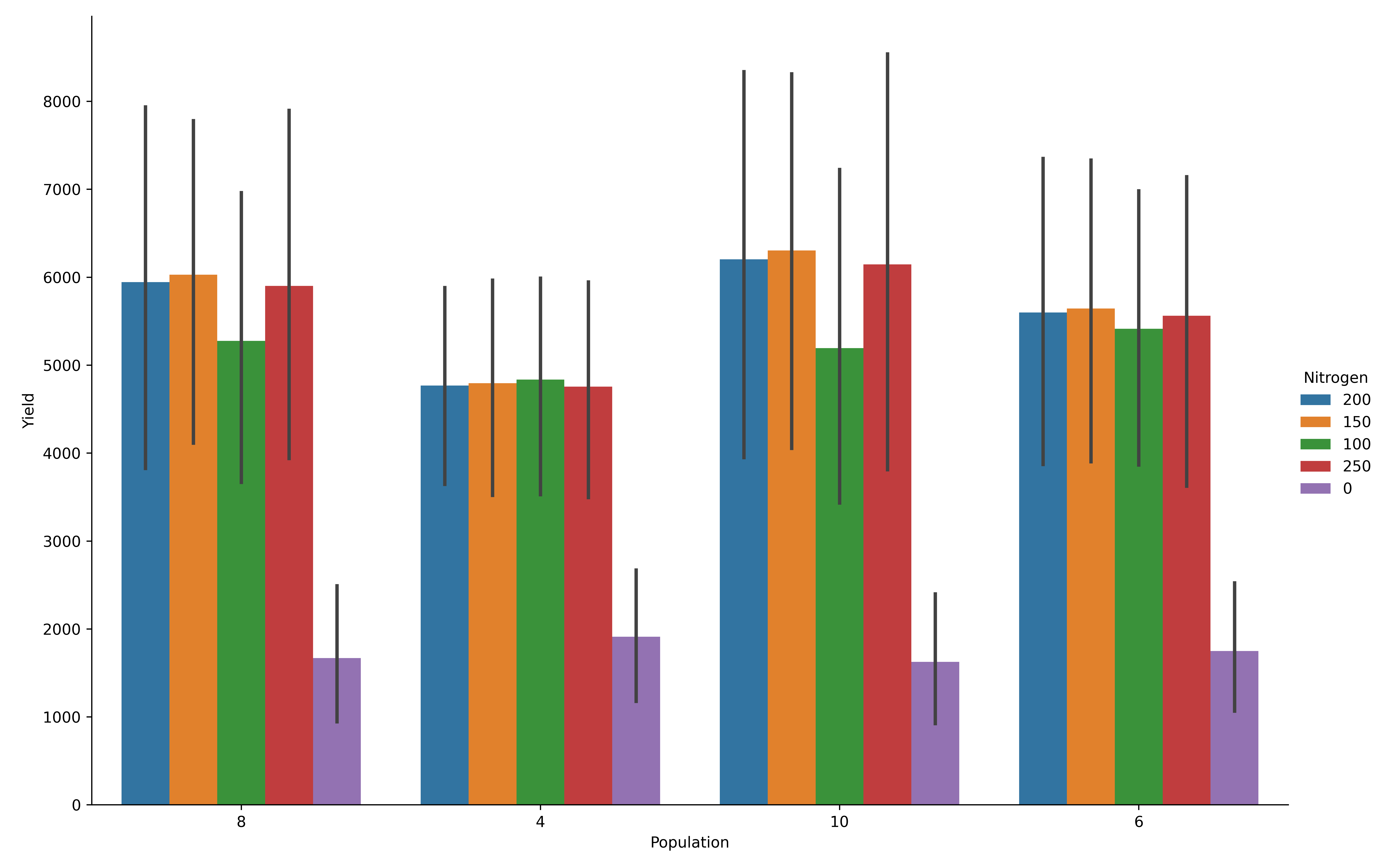
Bar Plots
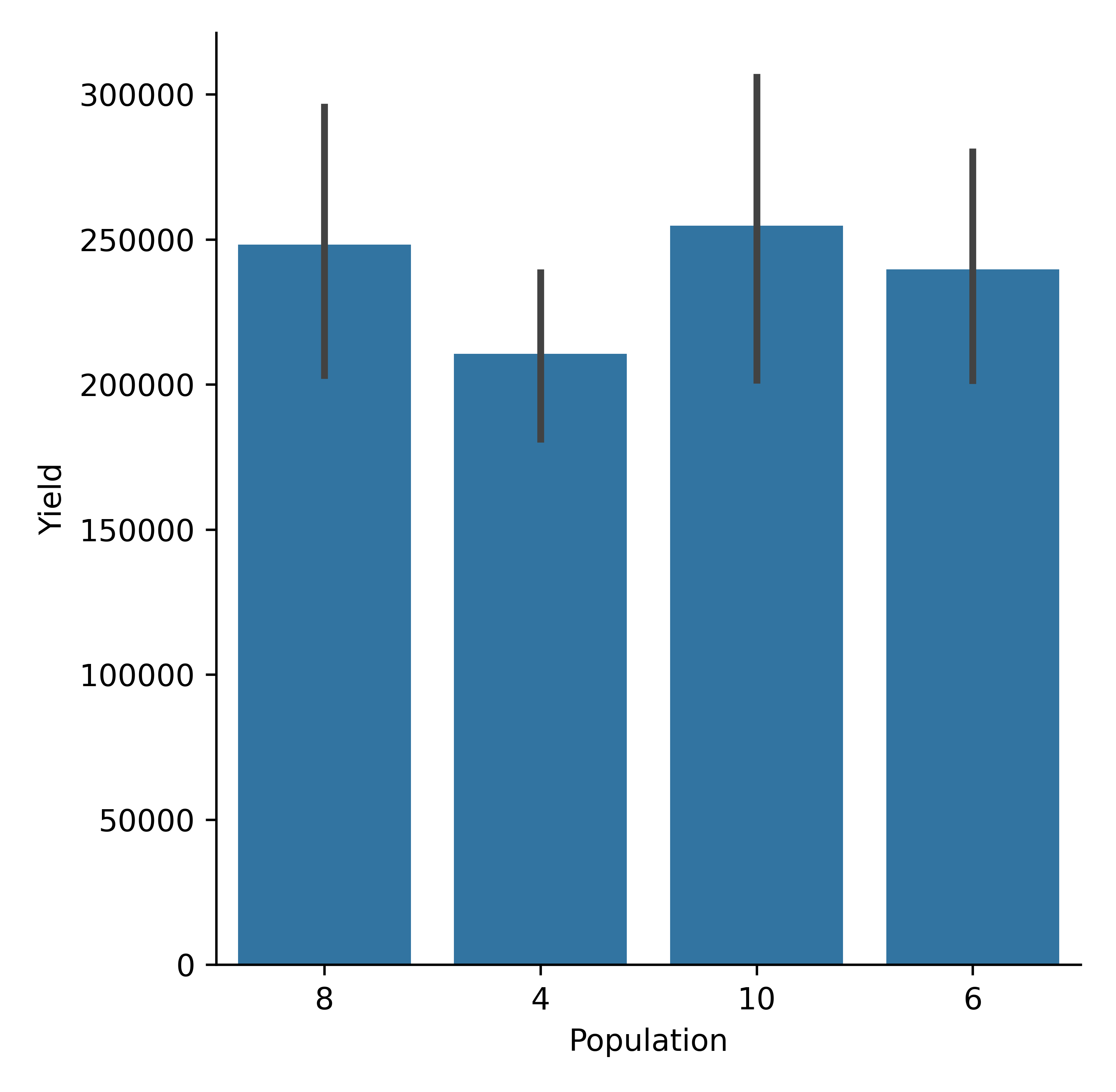
model.cat_plot(table = 'Report', y='Yield',
  x= 'Population', kind = 'bar', hue= 'Nitrogen', height=8, aspect=1.5)
Maize yield variability by population density (bar plot).
Changing statistical estimators. The example below shows how to switch estimators, and after the change to sum, the y-axis is now inflated
model.cat_plot(table = 'Report', y='Yield', x= 'Population', kind = 'bar', estimator='sum')
Maize yield variability by population density (bar plot, estimator =sum).
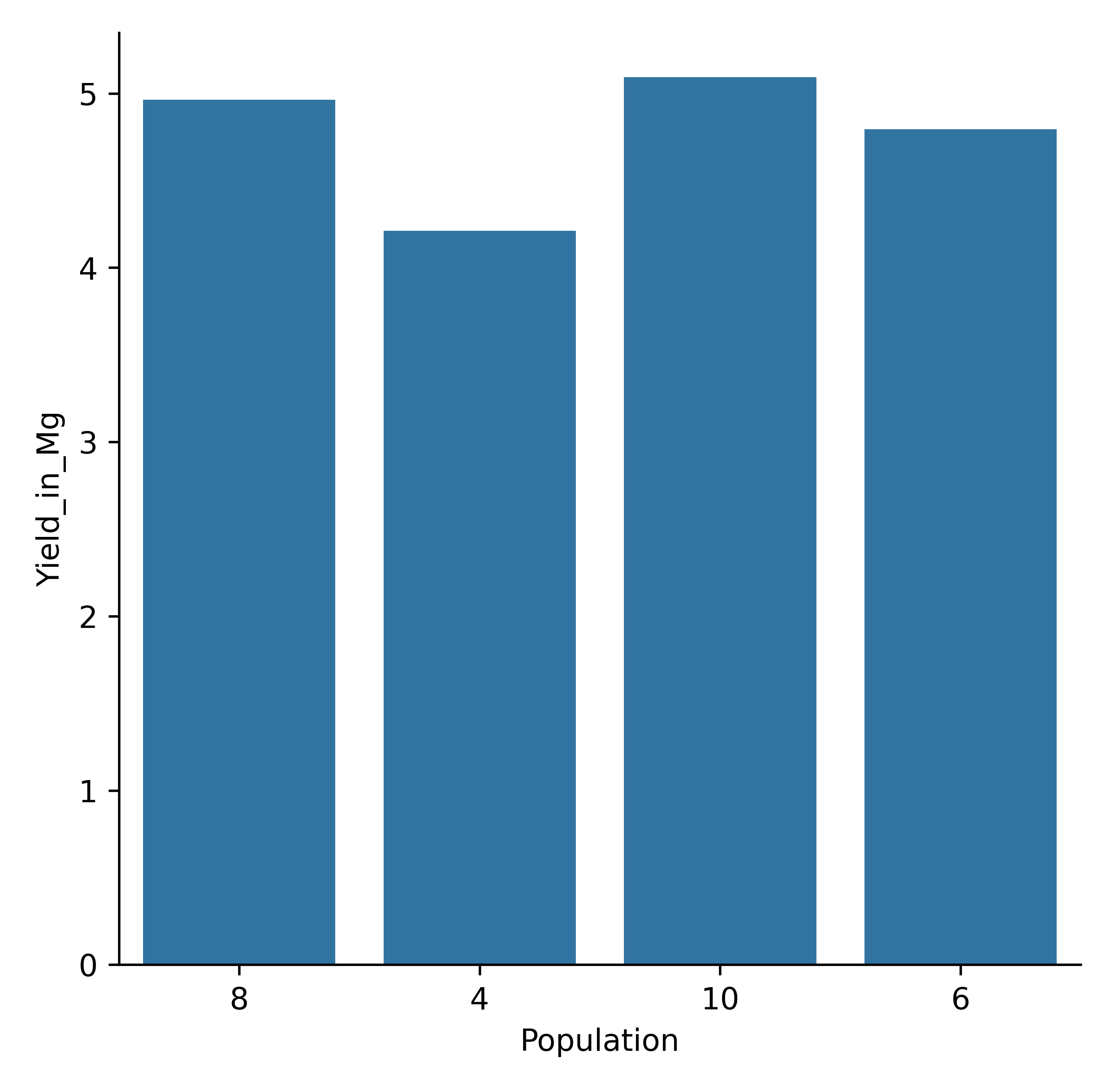
If you want to plot in a different unit or apply on-the-fly calculations, all plotting methods allow simple mathematical expressions to be passed, as shown below.
model.cat_plot('Report', expression="Yield_in_Mg = Yield/1000",
           y='Yield_in_Mg', x= 'Population', kind = 'bar', errorbar=None)
Maize yield variability by population density in Mg (bar plot, estimator =sum).
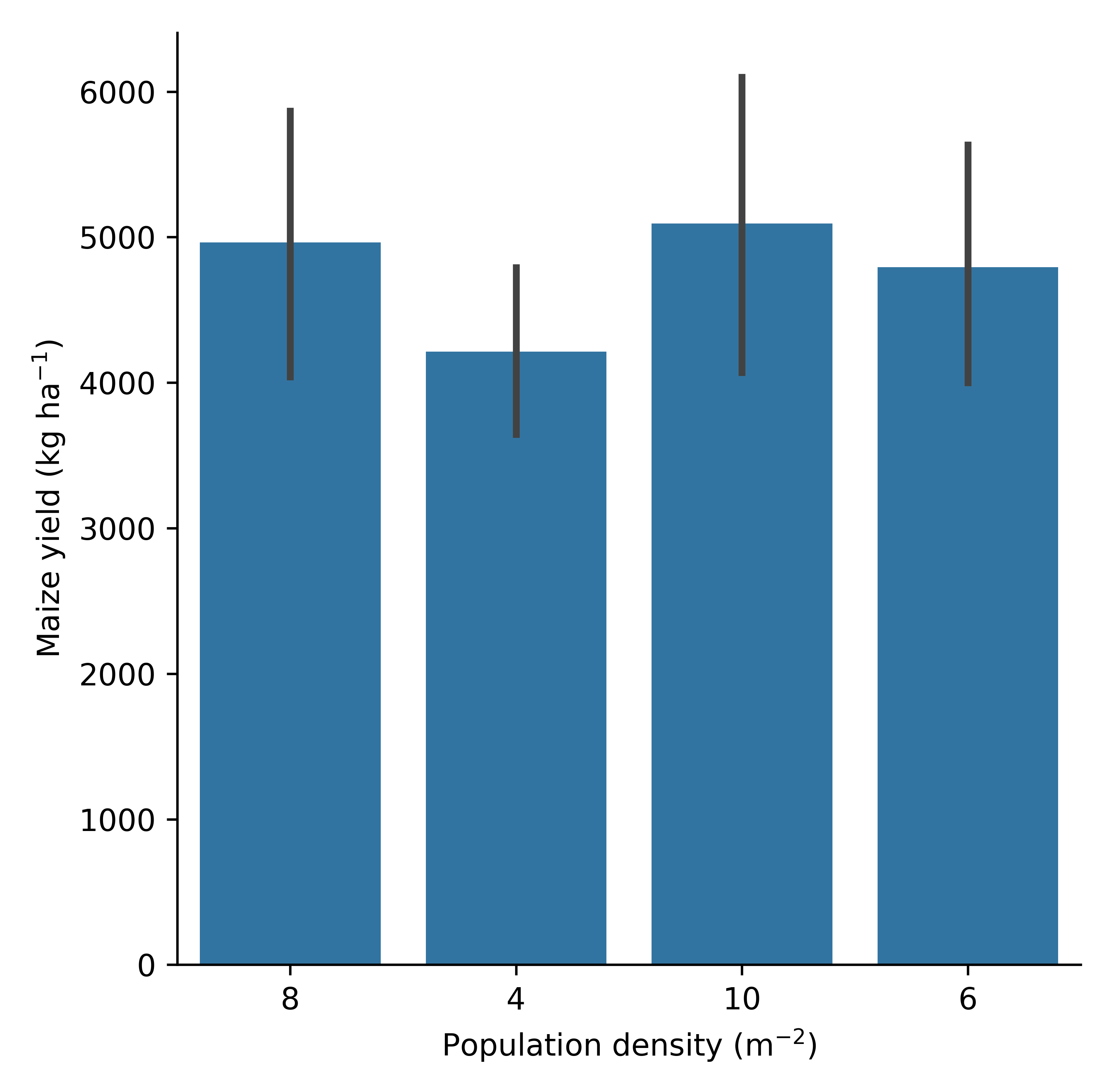
Tidy up the plots for reporting
The heavy lifting is done; now polish the figure—adjust labels, titles, and size. All plotting methods on ApsimModel and ExperimentManager return a seaborn.axisgrid.FacetGrid, so you can keep customizing afterward. Because Seaborn sits on Matplotlib, any Matplotlib styling you pass (or apply later) still works.
g= model.cat_plot(table = 'Report', y='Yield', x= 'Population', kind='bar')
g.set_axis_labels(r"Population density (m$^{-2}$)", r"Maize yield (kg ha$^{-1}$)")
g.set_titles("Yield vs population density")
Maize yield labeled plot (bar plot).
Passing a custom dataset
Because apsimNGpy plotting wraps Seaborn, you don’t need extra imports for most advanced visuals or after some advanced calculation on your dataset.
When you want to pre-compute values or reshape data yourself, use the table argument: it accepts None, a table name (str) from the model’s database, or a pandas.DataFrame.
table=None : uses self.results from the model.
table=”Report” : (str): loads that table from the DB.
table=df (DataFrame) : uses your custom, in-memory data.
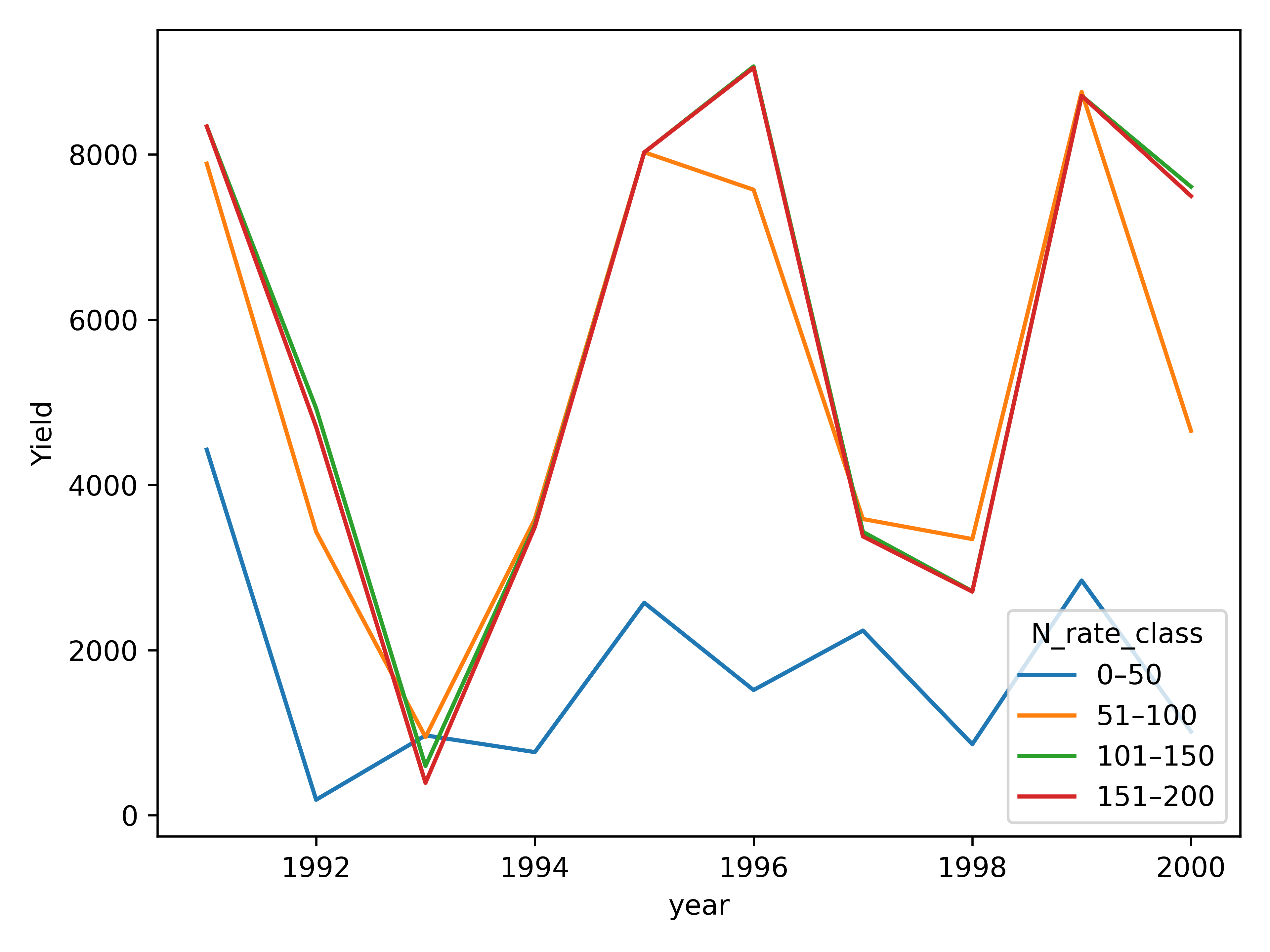
The example below shows how to convert a numeric nitrogen Amount to an ordered categorical (for cleaner legends/ordering) and pass it straight into any plotter:
import pandas as pd

 # Example: start from model results (or load a table)
 df = model.results.copy()  # or: df = model.get_simulated_output("Report")

 # Convert nitrogen rate to an ordered categorical for consistent ordering/legend
 bins = [0, 50, 100, 150, 200, 250]
 labels = ["0–50", "51–100", "101–150", "151–200"]
 # 1) Coerce to numeric
 df = df.copy()
 df["Nitrogen"] = pd.to_numeric(df["Nitrogen"], errors="coerce")

 # 2) Handle NaNs (drop or label them)
 # Option A: drop rows with invalid Amount
 df = df.dropna(subset=["Nitrogen"])
 # Option B: keep them and fill a placeholder after cut

 # 3) Define consistent bins & labels
 bins   = [0, 50, 100, 150, 200]           # strictly increasing
 labels = ["0–50", "51–100", "101–150", "151–200"]  # len=4 = len(bins)-1

 # 4) Cut (older pandas? remove ordered= and set later)
 df["N_rate_class"] = pd.cut(
     df["Nitrogen"],
     bins=bins,
     labels=labels,
     include_lowest=True,
     right=True,  )

 # Optionally, sort by the new category
 df = df.sort_values("N_rate_class")

 # Use the custom DataFrame directly via `table=...`
 # Example 1: line series
 model.series_plot(
     table=df,
     x="year",
     y="Yield",
     hue="N_rate_class", errorbar=None

 )
 plt.tight_layout()
 plt.savefig("series_ordered.png")
Maize yield ordered plot (Line plot)
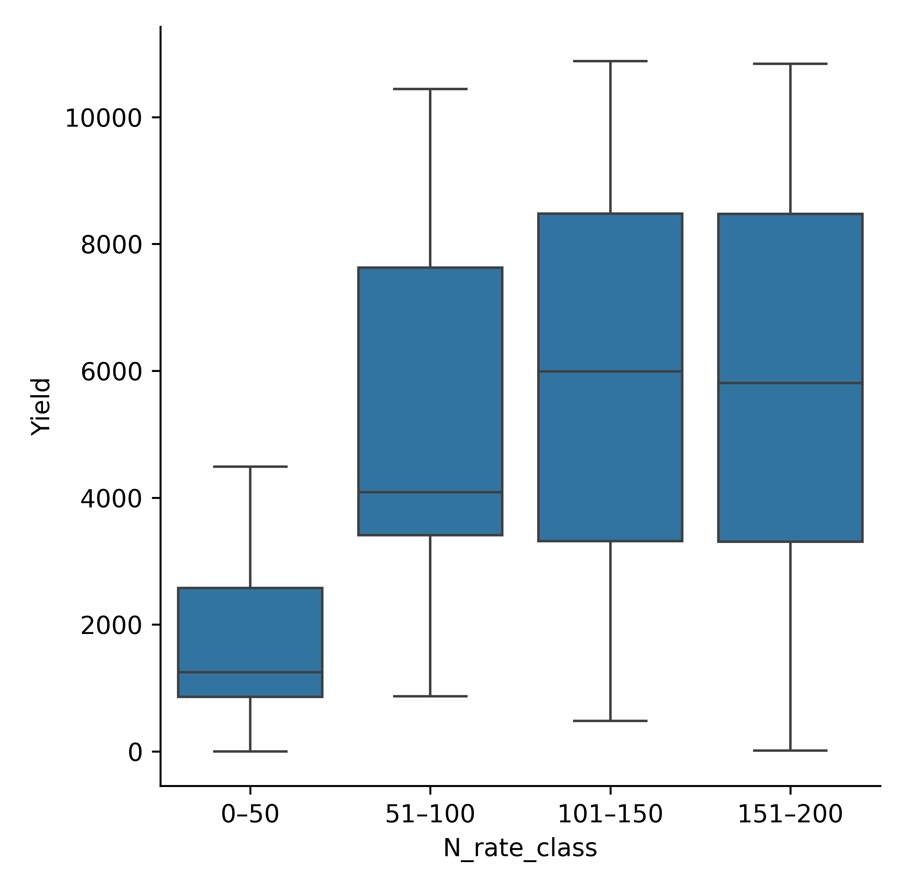
# Example 2: categorical plot (e.g., box/violin via catplot)
model.cat_plot(
    table=df,
    x="N_rate_class",
    y="Yield",
    kind="box"
)
plt.savefig(p/"binned_cat_plot.png", dpi =600)
Binned Maize yield (bar plot).
Meta info
Notebook generated by;
APSIM version: `APSIM 2025.8.7844.0`
apsimNGpy version 0.39.10.17
See also